Has the photographer lost his head?
March 11, 2008 Art Criticism, Portrait Photographyhere is a photograph of Jack Nicholson on the cover of the March/April 2008 AARP magazine. I am struck by the photographer’s use of depth of field. In the photo, the main part of Nicholson’s face is in focus while his left ear, the top of his head, and his shoulders are out of focus. I looked inside the front cover for the photo credit and discovered it was shot by Sam Jones.
I wanted to see more of Sam Jones’ work so I did a Google search on his name. I don’t know if it is the same Sam Jones (see the reader’s comment below), but I came across the website of a certain Sam Jones and looked at her work. I was struck by the way she does her head shots.
If you log onto Sam Jones’ website by clicking –HERE– and look at the bottom row of photographs, you will see three head shots. The second photo in the row is a color portrait of a woman, and Jones has included her entire head in the photograph. The last two images in the row, on the other hand, are head shots in which the top part of the subject’s head is cut off by the frame.
I have seen other photographers make similar compositions and I generally find such pictures disturbing.
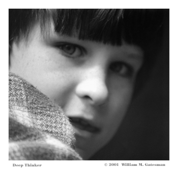
Not to be dogmatic, however, in the photograph I call “Deep Thinker”, reproduced above, the subject’s whole face is not shown. In that instance, it was not possible for me to include the whole face, because “Deep Thinker” is a photograph of a child peering out from the small round window in a concrete castle on a playground, and in any event, I think this photo is successful with the close focus on the subject’s face.
In my view, with a traditional straight-on head shot, a composition I generally find dull in any event, to cut off the top of the subject’s head robs the image of closure.
To see my other portraits, click –HERE–
_________________
Jeff Gatesman comments:
“Interesting dichotomy, using an image you shot with the head cut off at the top to illustrate how you don’t like that form of cropping. You explain why you cropped the child so close when, in fact, I think it is very powerful the way it is, without explanation. The emotion of this photo is all in the eyes and a little in the mouth; there seems to be no reason to include all of his head. The highlights of his face surrounded by the dark edges creates a moody kind of power. There is also a shallow depth of field here that I like.”
You may view Jeff’s photographs by visiting his website www.gatesman.com
________________
Another reader comments:
“The Sam Jones you’re interested in is at www.samjonespictures.com. He recently released a photo monograph “the here and now”. I am a wilco fan, and he shot and directed the wilco documentary from a few years ago — that’s how I got into his work!“


