December 11, 2010
With digital cameras, photographers no longer have to pay much attention to the nature of light, and in particular, the color temperature of light, because digital cameras automatically adjust for differing light temperatures. For those of us who still shoot using film, however, color temperature is an important consideration.
I am a low budget photographer. Once a year, I set up a photo studio in my living room to take portraits of my family. Rather than purchase high cost studio lights for this purpose, I typically use low cost construction lights, although I recently picked up a high intensity movie light at an estate sale.
Both light sources have a color temperature of between 3200 and 3400 Kelvin. Sunlight has a color temperature of 5500 Kelvin at high noon on a sunny day. While the color temperature of the light is not an issue when I shoot using black and white film, which I have done in years past, this year, I decided to shoot using color print film.
Unfortunately, color print film is designed to record images under daylight lighting conditions. While a photo flash produces light with the same color temperature as daylight, my flash unit has died and I have not yet replaced it. And in any event, the flash is not sufficient to light my subject appropriately.
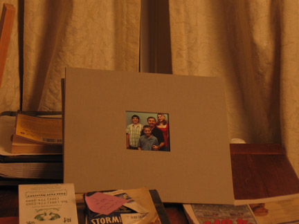
Below is a photograph of a scene shot in color using my budget lighting sources without modification. As you can see, the 3200 to 3400 Kelvin light sources leave a yellow color cast over the whole scene.

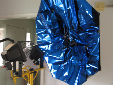
In order to rectify this situation without breaking the bank, I decided to change the color temperature of the light using reflectors. Fortunately, I had a reflecting umbrella with a blue tint to change the light temperature for the movie light, but my other reflecting umbrella had a silver surface, which did not change the color of the light. So what I did was purchase blue foil wrapping paper from the Party Store to line the inside of my second umbrella. Then, when I shine my construction lights into the umbrella, the reflected light has more blue in it thereby converting my 3200 Kelvin light to a 5500 Kelvin daylight equivalent. Below is a photo of the lighting set up.

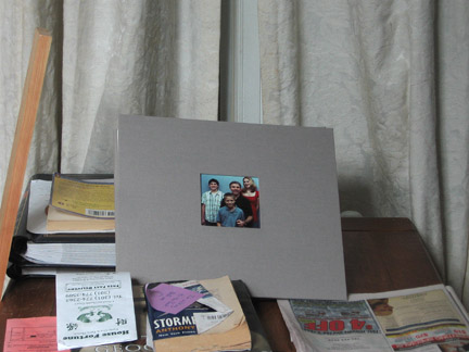
When I shot the same scene using the blue modified light, the colors were much more natural, as shown in the photo below.

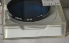
The other way to change the color temperature of the light would be to use an 80A or 80B lens filter. With the light sources I was using, an 80B would be the appropriate filter. However, doing so likely would have required a greater exposure compensation than would be required using the umbrellas. Because the blue filter reduces the amount of light that passes through the lens to the film, the shutter must remain open a longer period of time to make the photo. Below is a picture of my 80B filter.

I enjoyed my foray into the science of light and the process of light modification necessitated by my desire to shoot this year’s portraits using color film.
March 8, 2009
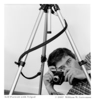
This picture come from a series of self portraits I captured circa 1999. I have added them to the Self Portaits gallery at www.wmgphoto.com. Check out Tom’s Wholesale Toy, a new photo added to the Still Life Gallery, while you are there.

May 31, 2008

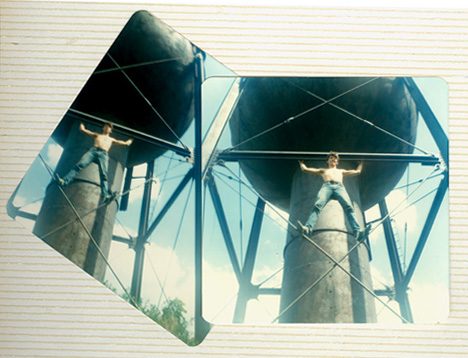
In 1978 I started playing around with the old cameras I had found in a cabinet in my dorm room in college. A friend and I captured this image while walking around Fairfield, Iowa, with my old plastic Ansco Anscoflex twin lens reflex camera, the one with the large dish flash attachment that took real flash bulbs, a box of which I found in the local used junk shop. I really enjoyed that simple camera, but alas, they don’t manufacture film for it anymore – it took 620 roll film. This is how the image (two similar photographs, actually) appears in my picture album from that era.
I am reminded of the Russian-made Holga or the Japanese-made Diana, both of them plastic, 120 format cult cameras. I just saw a new version of the Diana for sale in Urban Outfitters. The Ansco Anscoflex was my answer to the Diana.
March 11, 2008
here is a photograph of Jack Nicholson on the cover of the March/April 2008 AARP magazine. I am struck by the photographer’s use of depth of field. In the photo, the main part of Nicholson’s face is in focus while his left ear, the top of his head, and his shoulders are out of focus. I looked inside the front cover for the photo credit and discovered it was shot by Sam Jones.
I wanted to see more of Sam Jones’ work so I did a Google search on his name. I don’t know if it is the same Sam Jones (see the reader’s comment below), but I came across the website of a certain Sam Jones and looked at her work. I was struck by the way she does her head shots.
If you log onto Sam Jones’ website by clicking –HERE– and look at the bottom row of photographs, you will see three head shots. The second photo in the row is a color portrait of a woman, and Jones has included her entire head in the photograph. The last two images in the row, on the other hand, are head shots in which the top part of the subject’s head is cut off by the frame.
I have seen other photographers make similar compositions and I generally find such pictures disturbing.

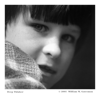
Not to be dogmatic, however, in the photograph I call “Deep Thinker”, reproduced above, the subject’s whole face is not shown. In that instance, it was not possible for me to include the whole face, because “Deep Thinker” is a photograph of a child peering out from the small round window in a concrete castle on a playground, and in any event, I think this photo is successful with the close focus on the subject’s face.
In my view, with a traditional straight-on head shot, a composition I generally find dull in any event, to cut off the top of the subject’s head robs the image of closure.
To see my other portraits, click –HERE–
_________________
Jeff Gatesman comments:
“Interesting dichotomy, using an image you shot with the head cut off at the top to illustrate how you don’t like that form of cropping. You explain why you cropped the child so close when, in fact, I think it is very powerful the way it is, without explanation. The emotion of this photo is all in the eyes and a little in the mouth; there seems to be no reason to include all of his head. The highlights of his face surrounded by the dark edges creates a moody kind of power. There is also a shallow depth of field here that I like.”
You may view Jeff’s photographs by visiting his website www.gatesman.com
________________
Another reader comments:
“The Sam Jones you’re interested in is at www.samjonespictures.com. He recently released a photo monograph “the here and now”. I am a wilco fan, and he shot and directed the wilco documentary from a few years ago — that’s how I got into his work!“
March 10, 2008

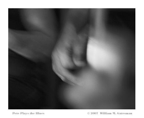
At an impromptu jam session, someone handed me a sketchpad and invited me to draw. I replied, “I sketch with my camera.”
The resulting image, Pete Plays the Blues, will be exhibited at the Laurel Art Guild’s 39th Annual Open Juried Exhibition at the Montpelier Arts Center in Laurel, Maryland, March 9 through March 30, 2008.
This image was created in camera on 35mm black and white film.
