May 31, 2008

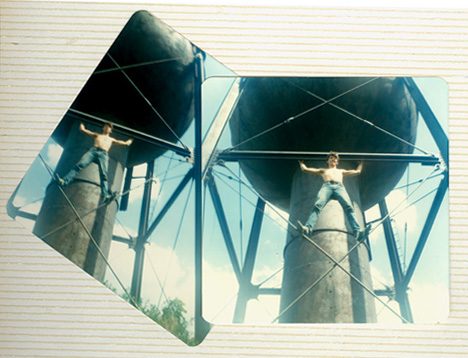
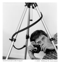
In 1978 I started playing around with the old cameras I had found in a cabinet in my dorm room in college. A friend and I captured this image while walking around Fairfield, Iowa, with my old plastic Ansco Anscoflex twin lens reflex camera, the one with the large dish flash attachment that took real flash bulbs, a box of which I found in the local used junk shop. I really enjoyed that simple camera, but alas, they don’t manufacture film for it anymore – it took 620 roll film. This is how the image (two similar photographs, actually) appears in my picture album from that era.
I am reminded of the Russian-made Holga or the Japanese-made Diana, both of them plastic, 120 format cult cameras. I just saw a new version of the Diana for sale in Urban Outfitters. The Ansco Anscoflex was my answer to the Diana.
May 25, 2008
I am preparing several photographs for an upcoming exhibit in Frederick, Maryland. I have been inspired to go beyond the pictures themselves and create works of art that, while centered on the photographs, provide a context for the images as well.
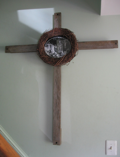
Schism II (shown below) incorporates the photograph, Schism, but includes a handcrafted weathered oak crucifix as a base for the photo, and a wreath of vines (crown of thorns?) as a frame for the image, adding layers of meaning not available from the photograph standing alone.

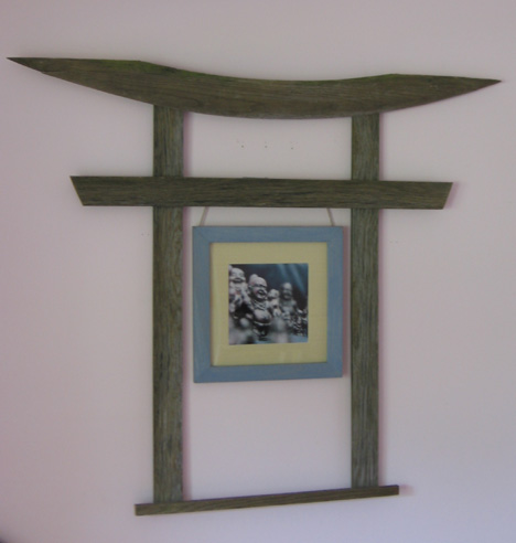
Welcome to Nirvana (shown below) uses the photo of the same name as its basis, but the photo floats within the open space of a Japanese Torii gate, which I constructed using weathered oak, as its context. It is as if the traveler (the small figure in the lower right corner) has just passed through the Torii gate to come face to face with the object of his longing. Also, I used a subtly colorized version of Welcome to Nirvana to create this piece.

To see a clearer image of the underlying photographs, visit the Focus on Religion gallery at www.wmgphoto.com and click on the thumbnail images.
May 13, 2008
I am hopeful that my photographs strike an emotional chord thereby enabling the viewer, if just for a moment, to step out of his or her limited sense of self. I was reminded of this phenomenon this past weekend.
A friend and I have just returned from our annual pilgrimage to the Bach festival in Bethlehem, PA. Discussing the generally recognized sacred nature of Bach’s music and our own individual thoughts and experiences in listening to the live performances, the following idea arose: Read the rest…
April 16, 2008
Magda Indigo publishes a photoblog. In a recent post which she calls Passion Indeed! Magda decries the lack of care people seem to give when posting images on the internet.
In looking through a friend’s Flickr gallery of photos from a recent family wedding, I was overwhelmed by the sheer volume of images, some of which had the faces of the subjects severely underexposed because the camera metered on the background light. Why, I wonder, were those pictures included in the gallery? I understand that many people simply dump the contents of the memory card from their camera onto the website; however, I am less likely to find the pictures that photographer really wants me to see if I have to slog through tens or even hundreds of mediocre images to separate the wheat from the chaff. I soon tire of the chore and might never see the “keeper” images.
I have also seen edited photo galleries where someone will post two versions of the same shot. Maybe one is cropped a little bit more, or one is black and white and the other color. I become confused: what is this photographer’s vision? Which image best conveys your sense of the subject? By seeing both versions, I don’t know which is the best effort and which the throwaway, and that steals the thunder from both of them.
One commentator to Magda Indigo’s blog post suggests that there should be a web site where people post only their greatest images. In my view, your audience would be well served if you treated whichever website you use to share your photos as just such a forum, one in which you post only those images that you feel to be among your best photos.
You may read Magda Indigo’s thoughts on this subject by clicking -HERE-.
March 11, 2008
here is a photograph of Jack Nicholson on the cover of the March/April 2008 AARP magazine. I am struck by the photographer’s use of depth of field. In the photo, the main part of Nicholson’s face is in focus while his left ear, the top of his head, and his shoulders are out of focus. I looked inside the front cover for the photo credit and discovered it was shot by Sam Jones.
I wanted to see more of Sam Jones’ work so I did a Google search on his name. I don’t know if it is the same Sam Jones (see the reader’s comment below), but I came across the website of a certain Sam Jones and looked at her work. I was struck by the way she does her head shots.
If you log onto Sam Jones’ website by clicking –HERE– and look at the bottom row of photographs, you will see three head shots. The second photo in the row is a color portrait of a woman, and Jones has included her entire head in the photograph. The last two images in the row, on the other hand, are head shots in which the top part of the subject’s head is cut off by the frame.
I have seen other photographers make similar compositions and I generally find such pictures disturbing.

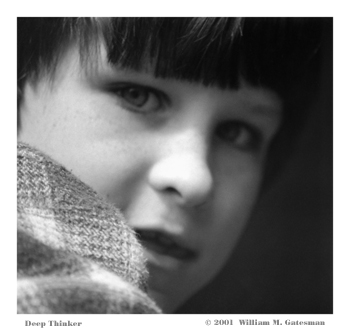
Not to be dogmatic, however, in the photograph I call “Deep Thinker”, reproduced above, the subject’s whole face is not shown. In that instance, it was not possible for me to include the whole face, because “Deep Thinker” is a photograph of a child peering out from the small round window in a concrete castle on a playground, and in any event, I think this photo is successful with the close focus on the subject’s face.
In my view, with a traditional straight-on head shot, a composition I generally find dull in any event, to cut off the top of the subject’s head robs the image of closure.
To see my other portraits, click –HERE–
_________________
Jeff Gatesman comments:
“Interesting dichotomy, using an image you shot with the head cut off at the top to illustrate how you don’t like that form of cropping. You explain why you cropped the child so close when, in fact, I think it is very powerful the way it is, without explanation. The emotion of this photo is all in the eyes and a little in the mouth; there seems to be no reason to include all of his head. The highlights of his face surrounded by the dark edges creates a moody kind of power. There is also a shallow depth of field here that I like.”
You may view Jeff’s photographs by visiting his website www.gatesman.com
________________
Another reader comments:
“The Sam Jones you’re interested in is at www.samjonespictures.com. He recently released a photo monograph “the here and now”. I am a wilco fan, and he shot and directed the wilco documentary from a few years ago — that’s how I got into his work!“
