February 21, 2012
Olga Rozanova, the early 20th century Russian avant-garde cubist painter discussed the process of making art, as compared to merely copying what one sees in nature, in the journal of the Union of Youth in 1913. Rozanova states that an artist whose works are nothing more than an “unconscious plagiarism of nature,” if only due to the artist “not knowing his own objectives,” for which the artist may be forgiven, must nevertheless be rejected, and the failure to reject such works amounts to “a plagiarism in the literal sense of the word, when people refuse to reject [such artworks] merely out of creative impotence.”
According the Rozanova, the artist must be more than a passive imitator of nature. Rather, the artist must be “an active spokesman of his relationship with [nature].”
How can one do this? According to Rozanova, “a servile repetition of nature’s models can never express all [of nature’s] fullness.” And so, in 1913, Rozanova declared that “it is time, at long last, to acknowledge this and to declare frankly, once and for all, that other ways, other methods of expressing the World are needed.”
Rozanova faults photographers, who, like the servile artists, “in depicting nature’s images, will repeat them.” She contrasts such plagiarists with one of “artistic individuality”, who, in depicting nature’s images, “will reflect himself.”
Might the same criticism be leveled against the popular photographic art of today? Today’s photographic artist must be careful not to fall into the trap of the “artist of the Past,” decried by Rozanova, who, “riveted to nature, forgot about the picture as an important phenomenon, [and] as a result, [the picture] became a pale reminder of what he saw, a boring assemblage of ready-made, indivisible images of nature, the fruit of logic with its immutable, nonaesthetic characteristics.” In a word, “Nature enslaved the artist.”
For Rozanova, the then burgeoning modern art was no longer “a copy of concrete objects; it has set itself on a different plane, it has upturned completely the conception of Art that existed hitherto.”

Rozanova’s prescription for creating works of art that are not mere plagiarized repetitions of nature is, “not only by not copying nature, but also by subordinating the primitive conception of it to conceptions complicated by all the psychology of modern creative thought: what the artist sees + what he knows + what he remembers, etc. In putting paint onto canvas, he further subjects the result of this consciousness to a constructive processing that, strictly speaking, is the most important thing in Art — and the very conception of the Picture and of its self-sufficient value can arise only on this condition.”
For the photographic artist, this constructive processing must inform the editing process as one reviews the various images captured in camera.
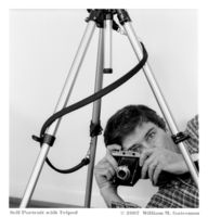
The image set forth above, Pete Plays the Blues, is far from a mere repetition of the image I saw in my viewfinder, and yet, it is the image that was captured on film. Some may have discarded this picture because it does not look like the subject framed in the viewfinder at the time the shutter was released. But to me, this image challenged me by revealing, in the Rozanova’s words, “the properties of the World,” from which I could “erect . . . a New World — the World of the Picture, and by renouncing repetition of the visible” I was able to create a different image that I was “forced to reckon with.”

How will the viewer respond to such a photograph? Rozanova observes that, “[f]or the majority of the public nurtured by pseudo artists on copies of nature, the conception of beauty rests on the terms ‘Familiar’ and ‘Intelligible.’ So when an art created on new principles forces the public to awaken from its stagnant, sleepy attitudes crystallized once and for all, the transition to a different state incites protest and hostility since the public is unprepared for it.”
By that measure, both Pete Plays the Blues, and the photo, On the Dressing Table, which is set forth above, might be said to have gone beyond the mere repetition of nature. In each case, upon first showing these photos to a friend and critic, he responded with protest. Indeed, it was not until I wrote this essay that that I recognized the significance of this unmanipulated photograph, which like the cubist paintings about which Rozanova wrote, shows my subject from multiple points of view all in the same frame.
Another image in which the resulting picture differs substantially from the subject I saw in my camera’s viewfinder is Boys at Play, reproduced below.

For Rozanova, and dare I say, for the photographic artist who strives to be something more than nature’s plagiarist, it is essential that one create works of art that are “self-sufficient,” that is, images that enjoy absolute “liberation . . . from the alien traits of Literature, Society, and everyday life.”

The photograph above, Maritime Abstraction, and other photographs that I hope are more than mere plagiarisms of nature, are shown in my online photo gallery at www.wmgphoto.com.
Olga Rozanova’s essay is reproduced in the book Art in Theory, 1900 — 2000, An Anthology of Changing Ideas, by Charles Harrison and Paul Wood.
April 16, 2008
Magda Indigo publishes a photoblog. In a recent post which she calls Passion Indeed! Magda decries the lack of care people seem to give when posting images on the internet.
In looking through a friend’s Flickr gallery of photos from a recent family wedding, I was overwhelmed by the sheer volume of images, some of which had the faces of the subjects severely underexposed because the camera metered on the background light. Why, I wonder, were those pictures included in the gallery? I understand that many people simply dump the contents of the memory card from their camera onto the website; however, I am less likely to find the pictures that photographer really wants me to see if I have to slog through tens or even hundreds of mediocre images to separate the wheat from the chaff. I soon tire of the chore and might never see the “keeper” images.
I have also seen edited photo galleries where someone will post two versions of the same shot. Maybe one is cropped a little bit more, or one is black and white and the other color. I become confused: what is this photographer’s vision? Which image best conveys your sense of the subject? By seeing both versions, I don’t know which is the best effort and which the throwaway, and that steals the thunder from both of them.
One commentator to Magda Indigo’s blog post suggests that there should be a web site where people post only their greatest images. In my view, your audience would be well served if you treated whichever website you use to share your photos as just such a forum, one in which you post only those images that you feel to be among your best photos.
You may read Magda Indigo’s thoughts on this subject by clicking -HERE-.
March 11, 2008
here is a photograph of Jack Nicholson on the cover of the March/April 2008 AARP magazine. I am struck by the photographer’s use of depth of field. In the photo, the main part of Nicholson’s face is in focus while his left ear, the top of his head, and his shoulders are out of focus. I looked inside the front cover for the photo credit and discovered it was shot by Sam Jones.
I wanted to see more of Sam Jones’ work so I did a Google search on his name. I don’t know if it is the same Sam Jones (see the reader’s comment below), but I came across the website of a certain Sam Jones and looked at her work. I was struck by the way she does her head shots.
If you log onto Sam Jones’ website by clicking –HERE– and look at the bottom row of photographs, you will see three head shots. The second photo in the row is a color portrait of a woman, and Jones has included her entire head in the photograph. The last two images in the row, on the other hand, are head shots in which the top part of the subject’s head is cut off by the frame.
I have seen other photographers make similar compositions and I generally find such pictures disturbing.
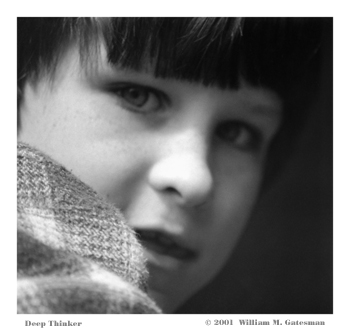
Not to be dogmatic, however, in the photograph I call “Deep Thinker”, reproduced above, the subject’s whole face is not shown. In that instance, it was not possible for me to include the whole face, because “Deep Thinker” is a photograph of a child peering out from the small round window in a concrete castle on a playground, and in any event, I think this photo is successful with the close focus on the subject’s face.
In my view, with a traditional straight-on head shot, a composition I generally find dull in any event, to cut off the top of the subject’s head robs the image of closure.
To see my other portraits, click –HERE–
_________________
Jeff Gatesman comments:
“Interesting dichotomy, using an image you shot with the head cut off at the top to illustrate how you don’t like that form of cropping. You explain why you cropped the child so close when, in fact, I think it is very powerful the way it is, without explanation. The emotion of this photo is all in the eyes and a little in the mouth; there seems to be no reason to include all of his head. The highlights of his face surrounded by the dark edges creates a moody kind of power. There is also a shallow depth of field here that I like.”
You may view Jeff’s photographs by visiting his website www.gatesman.com
________________
Another reader comments:
“The Sam Jones you’re interested in is at www.samjonespictures.com. He recently released a photo monograph “the here and now”. I am a wilco fan, and he shot and directed the wilco documentary from a few years ago — that’s how I got into his work!“
November 14, 2007
On November 11, I wrote an article on Depth of Field in a Digital World and illustrated the post with two photographs. One of those photos, Renaissance Acrobat is a color image of a young woman in a ring suspended in midair. I was working on that picture to submit it to the Maryland Renaissance Festival 2007 photo contest, not because I thought that the photo was a particularly moving image, but because I thought it was a good fit for one of their categories. I have not, however, posted the image to my online Photo Gallery.
The reason I used Renaissance Acrobat in the article is that it served to illustrate my point about the limitations of digital cameras with respect to one’s ability to create an image with a short depth of field. I find Country Store, the other image in that article to be a much more compelling photograph.
I write this post because I am ambivalent about Renaissance Acrobat. I strive to show only my best work on this website and in my online Photo Gallery. I endeavor to create photographs that are emotionally compelling. I feel that Renaissance Acrobat falls short of this ideal. Nevertheless, I will retain the Renaissance Acrobat image on the overflow page of the post as an example of the point I was making.
November 1, 2007
Paul Indigo, in his blog Beyond the Obvious has stated that: “If you look at the great masters of photography and their images, many of which have become iconic, you see that there is a distinct gap between text book perfection and what they’ve produced. Most great pictures that touch our hearts have technical flaws. . . . But it doesn’t matter because there’s so much emotion and power in their images.”
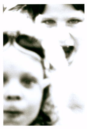 The image in this post, Boys at Play, is a scan of a black and white photograph I created in a traditional wet darkroom. The negative for this image contains much more visual information than the print, however I used an Ilford Mutigrade filter on my enlarger which had the effect of creating the more posterized image you see here. I suppose one might be able to create a similar effect using the posterize feature in photoshop, but I don’t know if that would yield the same result with this image as I obtained using traditional photo processing techniques.
Given the posterized nature of this picture, one might argue that it is not a technically perfect representation of the subject. Nevertheless, for me, it is an effective photograph because, without fail, I have an intense emotional reaction every time I view Boys at Play.
The same can be said about “Robert Capa’s shots of the Normandy landing”, to give but one of the examples pointed out by Paul Indigo. Capa’s photograph of a soldier wading in the ocean towards the shore is blurry and grainy and by no means a technically perfect image, but it is one to which I have a strong emotional response. For me, this photograph successfully captures what it must have been like to be that soldier in that circumstance.
With Boys at Play my response is something akin to dread. But, being the father of two sons, I know that boys (and their dads) often engage in rough play, play that to an outside observer may appear to be something more sinister. I believe that Boys at Play is a successful image insofar as it captures the sinister-looking nature of the interaction between two boys.
You may view a larger version of Boys at Play by logging on to the Surreal Portraits Gallery at my online Photo Gallery at www.wmgphoto.com by clicking –here–
To view Paul Indigo’s blog post Great images may be techically flawed, click –here–
Robert Capa’s most famous Normandy landing photograph can be viewed –here–
________________________________________
Paul Indigo comments:
“Interesting article and I appreciate the way you share your personal feelings about Boys at Play. The emotion in the image hits you straight away and photography is after all about communication, not slavishly following a set of dogmatic rules. I suppose the idea that you and I are trying to get across can be summed up in a simple question: ‘Do you want to be the best rule follower in the world or the best visual communicator?'”